
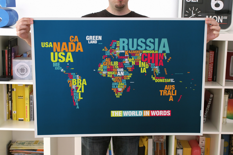
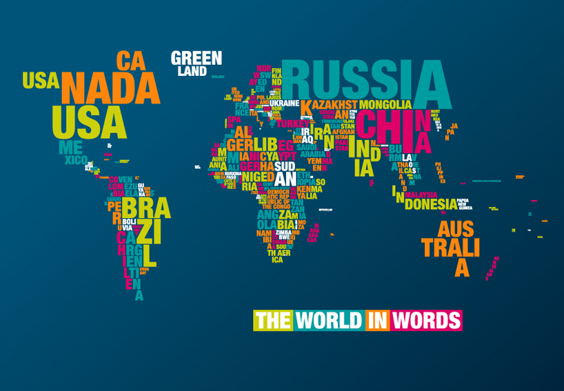
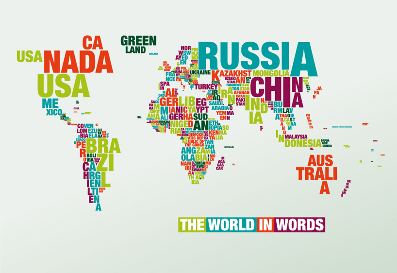
A map that combines the elements of geography with typography. the shape and size of
the countrys' names are set to correspond with the respective land mass. to attain a level
of likeness that couldn't be achieved with automatically generated computer program,
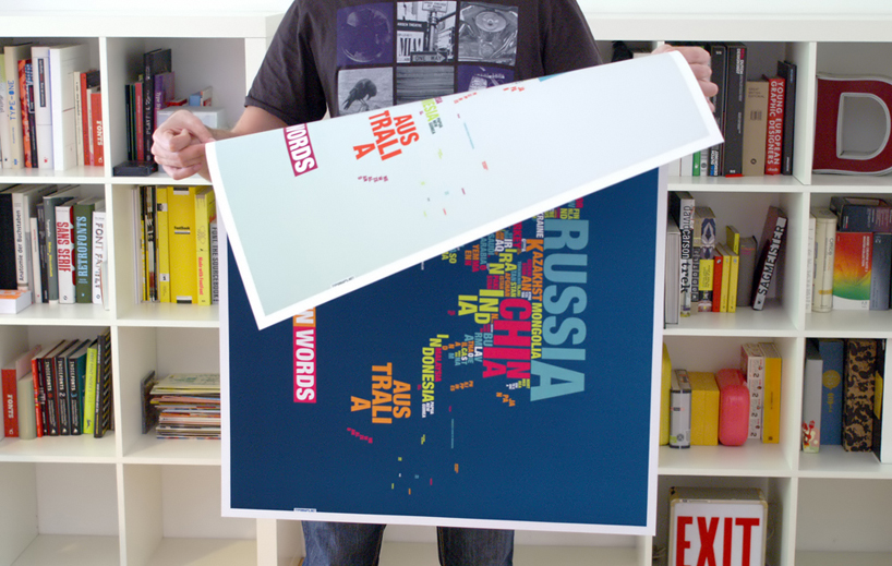
each letter is carefully handset. dark blue on one side and light blue on the other,
the double-sided poster uses helvetica neue black condensed as its font of choice.
No comments:
Post a Comment